Advertising, Marketing Strategy
2022 Color Trends
March 14, 2022

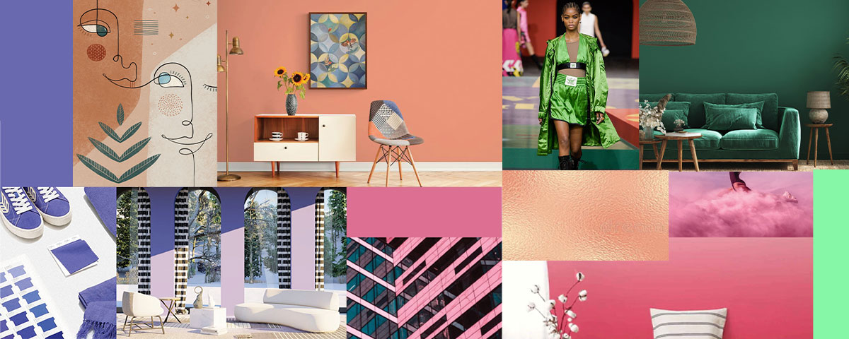
Color in design is one of the most powerful tools for visual communication, influencing one’s decisions, mood and behavior. Choosing the right colors in print and web is vital to your brand message and story.
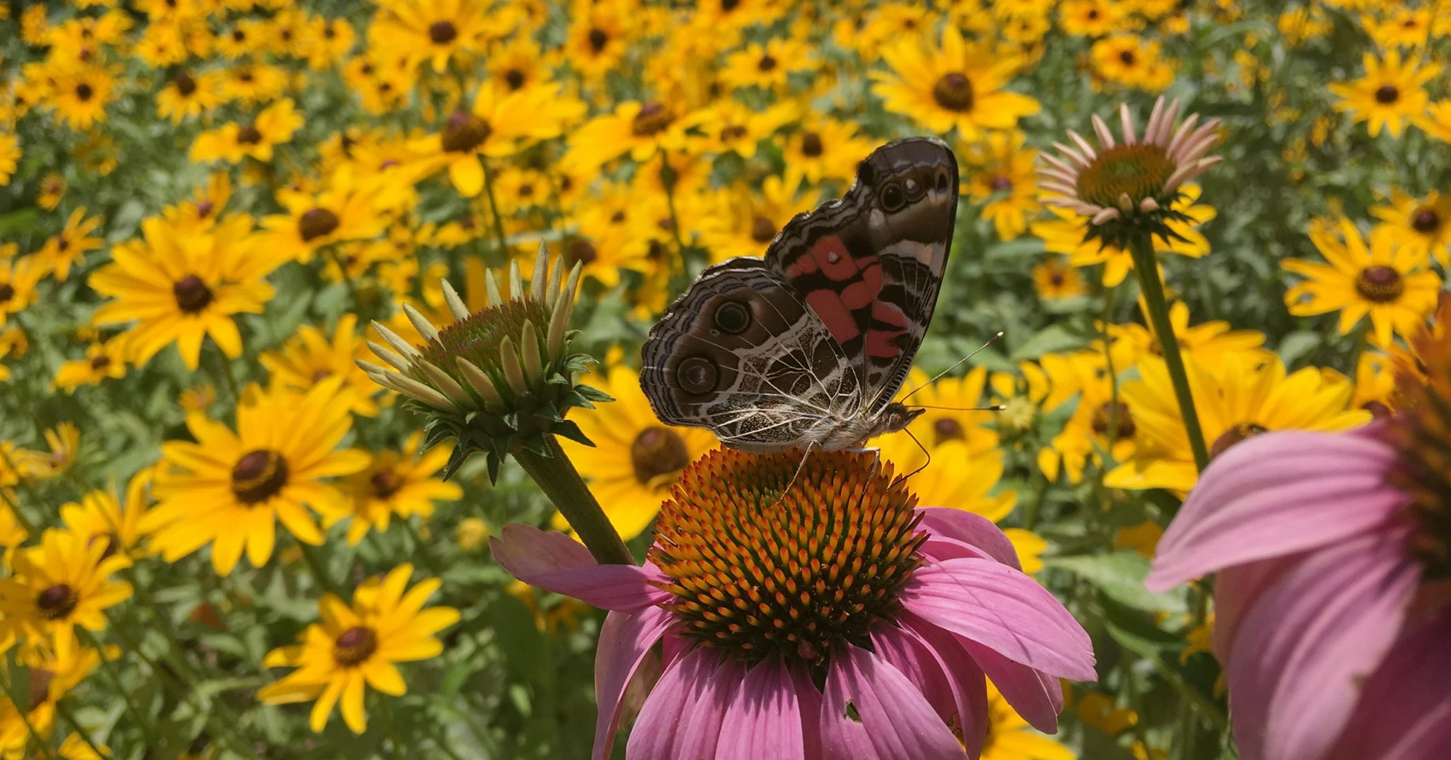
Colors in fashion, photography, print and interior design all influence one another and pulling inspiration from each industry will broaden your appeal and audience reach.
Here are some standout color trends for 2022 that we are excited to see!
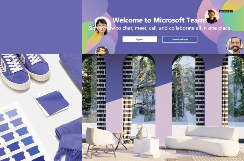
Very Peri / Periwinkle
Let’s start with the mecca of color management: Pantone. Their 2022 color of the year is PANTONE 17-3938 Very Peri. Pantone describes it as confident, carefree, curious and animated. It causes us to rethink and reimagine some of the qualities of the trusted blue color family with a new perspective.
We are in a time of transformation and transition away from periods of isolation where our physical and digital spaces merged more than ever. The rise of social gaming and time spent on our digital devices increased which allows our limits of reality to be stretched and pushed.
Very Peri represents the artistic digital community and how colors can be manifested in the modern world to create new color possibilities. According to PANTONE, Very Peri represents the “fusion of modern life and how color trends in the digital world are being manifested in the physical world and vice versa.”
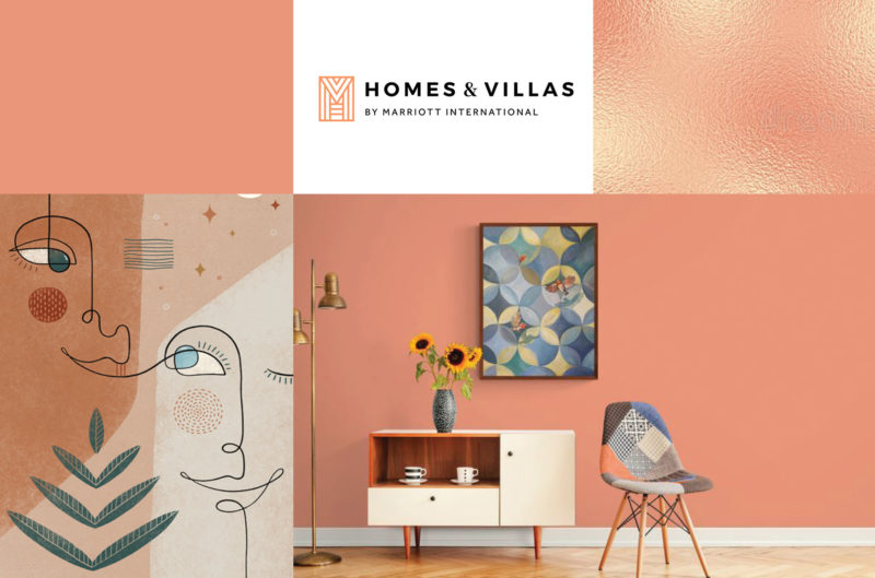
Calming Coral (#E9967A)
This midcentury-inspired color is soothing and calming with a subtle pop to draw the eye in. Its warm tone allows the viewer to feel comfortable and accepted. Consider pairing it with a dusty yellow or natural earth tones to further the nostalgic feel to your designs. With the rise of sustainability and DIY/organic designs, a desire for earthy hues has taken rise in the print and digital space which all work perfectly with a calming coral.
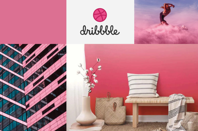
Pacific Pink (#DB7093)
According to Shutterstock, this is set to take the stage as the trendiest color of 2022. Its subtle rosy hue feels cheeky and giddy like a pair of joyful rosy cheeks. It nods to the retro era and pairs well with secondary pink and teal tons. Muted palettes are popular for a modern and minimalist look. Using gentle and muted hues create a sense of elegance and understated class. Faded retro color palettes are another trend for 2022 and Pacific Pink falls perfectly in that line, creating a sense of comfort and ease.
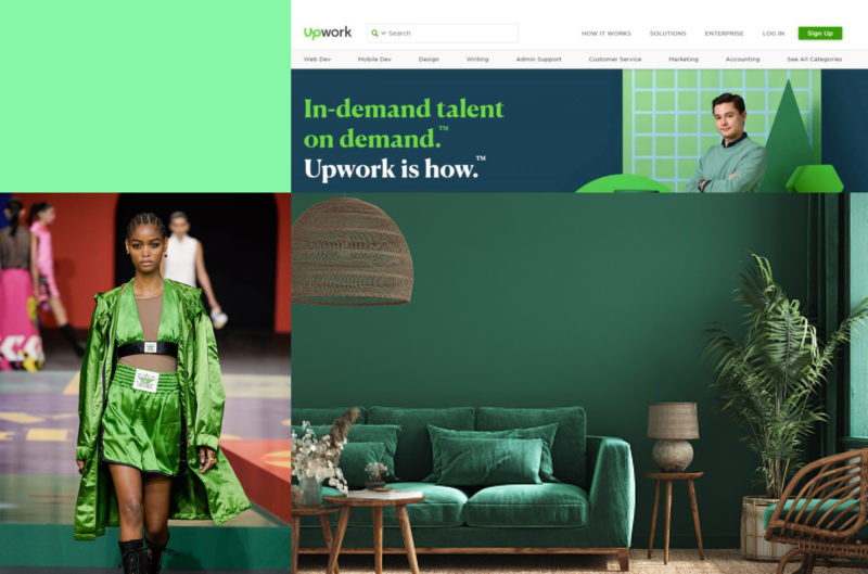
Green Reigns Supreme
This year’s data from Shutterstock proves that ads containing green hues and tones commanded click-through rates above those that did not. Color blocking and the use of bold colors in flat design are ways to add pop and attention to your work. Consider incorporating emerald, lime, chartreuse and so many other green shades into your next designs.