
Digital Marketing, Web Design, Wordpress
New Web Design Trends to Watch for 2014: Part 1
January 20, 2014


Thenextweb.com came out with their 10 Web Design Trends you can expect to see in 2014. While some were a little underwhelming, two trends really tickled our feathers: “Large Hero Areas are Quickly Killing Sliders” and “Simplified Content.”
THE HERO
Just as in print design, the hero area (intro area) is the main attention-grabber for the reader on the homepage. It can be a single photo or illustration, a strong and powerful headline or both. You want to show your main message clearly (think headline), and if your website is a sea of information a powerful hero area can do just that. You’re ultimate goal should be to convey your message, generate a connection and keep the viewer engaged . Don’t worry about trying to squeeze multi-layered messages in the hero area – you want to leave the reader with enough information to understand your main message but still eager to scroll down to see more detail.
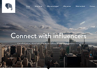
Check out this great example from www.tribalmedia.com which does just that!
Now that you’re ready to jump into 2014 and take advantage of large hero areas what should you do next? Easy, just create a compelling illustration or find that one photo that says it all! Easier said than done- we know! If you don’t have photos readily at your disposal, or you’re working with a tight deadline stock imagery is a great resource for designers. There are endless selections of photos out there to choose from; some good, some bad, some copyrighted (be careful!) and some that just leave you puzzled, but it’s just a matter of digging through the content to find that one shot that makes you stay on the page that extra minute. That one shot that captures the essence of what you’re selling. Another great option is hiring a photographer, if budget allows. This is the best way to collect and have control over the images for your designs.
KEEP IT SIMPLE
With social media leading the way in the digital era, Simplified Content (or short bursts of content, a-la Twitter) is predicted to take charge in web design this new year. Is it a sign that our attention spans are depleting, or that we simply don’t want to read a lot? Either way, it’s time to simplify!
When publishing online, whether it’s imagery or written content, you only have seconds to grab your viewer’s attention before something else comes along to steal the show. Simplified content allows us to make it easier, and faster for viewers to scan the page, read what they want, and click away. Today, there is a heavy focus on ensuring websites are also mobile-friendly, and this content model makes it inherently easy to translate into the mobile world.
While content is pushing toward a simplified model, this doesn’t mean we should use Twitter short-code and Tweet-appropriate abbreviations, but what it does mean is that easily visible, readily available and simple content better serves today’s online readers.
This example that Yellow Duck Marketing designed for www.edgelineflats.com shows three distinct areas of simplified content as you scroll the page. Even if you aren’t taking the time to read the webpage content carefully, these large areas of bold and clear type are still able to resonate.

Ready to dive into some of 2014’s web design trends? Remember; utilize attention-grabbing large hero areas and create concise and purposeful content that is visible, simple and impactful. What do you hope to see in web for 2014?
Want to know how Yellow Duck Marketing can help you with your website? Fill out this form and we’ll be in touch to help you reach your goals!