
Content Creation
5 Tips for Choosing Stock Photography that Makes an Impact

A picture is worth 1,000 words. Choosing stock photos can be overwhelming and while a photo doesn’t really have to portray 1,000 words, it does need to convey an emotion and resonate to the viewer in the specific way you intend. Here are a 5 tips on how to select the best photos for your marketing:
- Remain on Brand
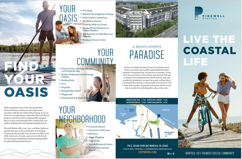
Choose images that truly reflect the message you are wanting to communicate. Remaining on target with the brand voice establishes credibility and trust. A great example is what we did for Pinewell Station, where the client wanted to show every aspect of living the coastal life. Even though this property is located on the Chesapeake Bay, we intentionally chose a range of imagery that represented more than the obvious waterfront amenity.
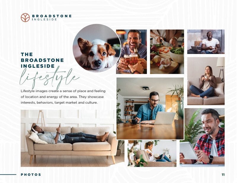
- Consistency Ensure all images have similar photo filtering and styling to have a cohesive brand essence. You don’t want some to feel overly saturated while others are more muted.This example page from a brand book for Broadstone Ingleside shows the importance of truly knowing who your target audience is and making sure that they are accurately represented within the brand. The lifestyle images are cohesive in style and warm tones which creates a comfort for the eye and helps future residents envision their life there.

- Authenticity
One stock photo trend for 2021 is authenticity. This past year has reignited the desire for true and unfiltered moments – appreciating life’s little things with those close to us. Avoid posed images that feel fake and inauthentic – real environments and portraying real emotion allow the viewer to connect on a deeper level to the brand.This ad campaign for Hartford Healthcare shows an “in the moment” photo that truly captures the subject’s pure joy. It doesn’t appear to be posed or staged and that is the goal. Success!
- Diversity
Another trend for 2021 is togetherness – photography of diverse audiences that represent our real society and world. The more an inclusive environment is shown, the more engaged and trusting an audience will feel toward your brand and message. It may be challenging to find stock photos that match your brand voice and style that have diversity in race, age and ability, but it is important to put forth the effort or investment to do so, not just to show how welcoming you are, but also because if you’re in the apartment or housing industry, Fair Housing laws are strict on language and imagery and that you can’t just show one narrow target market group.This wonderful example of Colgate’s campaign #SmileStrong, which shows a diverse group and their achievements, all with the same message in mind: a future we can smile about.
- Variety
When selecting multiple photos for a brand or marketing piece, it is smart to have a range of orientations, poses, subject matter, “negative” space for copy and vantage points. This allows variation for the eye and opens your creativity in the design.This selected page from the Draper Place brochure shows three distinct images that all represent the elevated lifestyle. Using different vantage points and subject matter treats the eye to balanced visual. Side note: the Draper Place brochure won a Hermes Platinum Award for best brochure in 2019.


Need help with selecting stock photography that works for your project? Contact us.