Web Design, Wordpress
New Web Design Trends to Watch for 2014: Part 2

In Part One on our marketing blog, we commented on two of the 10 Web Design Trends you can expect to see in 2014 from Thenextweb.com and now we’re back to give you two more budding trends, “Videos in Place of Text” and “Long Scrolling Sites.”
PRESS PLAY
As the year goes on we will start to see more videos taking center stage in the homepage hero section (remember those from Part 1?). Similar to captivating photos and illustrations, videos are another way to grab the viewer with interesting content in a dynamic way. Who doesn’t like watching something as opposed to reading it? With smart phones and social media at our fingertips, videos are increasingly easier to make, share and post, so why not translate that trend to the web? One can argue that videos contain large amounts of data and can possibly slow down your website, but they are an effective method to communicate in an unexpected way. Windows Movie Maker and iMovie are two great programs that allow you to compress videos while retaining good quality for easier and faster loading. Another bonus to using videos on your site, they can track how many views they’ve received, which can help you better plan future content and keep track of page visits – something that text can’t do on its own.
Check out this example that lives on HVACInvestigators.com, a website we designed in 2013 (ahead of the trend I might add) that deals with frankly some unsexy content. Their cheeky spin on what they do is much more fun to watch than read. How much better is that?

LET IT SCROLL
Who isn’t familiar with Pinterest or Facebook? These are probably the most visited websites that has implemented this growing trend, and have redefined our browsing behavior. Scrolling content gives the reader control of what information they want to scan and take in while keeping the content continually in eye view and not hidden away in tabs.
Keeping users in a ‘reading flow,’ you are decreasing the time it takes them to search for content, eliminating page load time, and giving readers a more seamless and natural user experience. Usually, the user doesn’t even realize how far they have actually scrolled! Even e-commerce websites like Fab.com or Polyvore incorporate this trend.
So, how do you keep the reader engaged and wanting to scroll (and scroll, and scroll)? Changing up colors, content layout, adding images (maybe even a video!), and dividing the page in sections, are great ways to keep the page fresh and exciting in this website model. Check out this example that utilizes the technique of Parallax scrolling, where the background and foreground move at different rates, giving the page the illusion of dimension and depth.
Along with its visual appeal, dividing the page into sections also makes the website and it’s content more responsive on mobile devices, ensuring the site looks great regardless of the screen size. Enhancing the user experience will not only increase time spent on your site, it will create a positive brand association and generate more returning page visits.
With smart phones in the hands of almost everyone, it’s easy to see why the concept of scrolling has become a more natural behavior as opposed to clicking, allowing this website model to take charge.
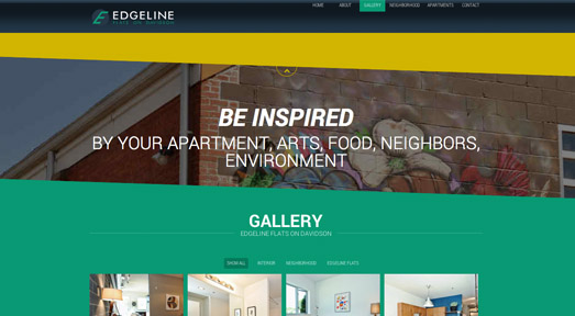
As we mentioned in 10 Web Design Trends Part 1, Edgelineflats.com is a great example of using Simplified Content, but it also serves as a model for Parallax scrolling. The reader becomes engaged in the changing background colors, content layout and imagery.
Do you want to explore redesigning your website for 2014? Fill out our form here.