Branding, Web Design
Nonprofit Rebranding: Creating Hope with One Place
March 31, 2021

In late 2019, Onslow County Partnership for Children, a nonprofit based in Jacksonville, N.C., approached us about rebranding their organization, which serves families and children in and around Onslow County, particularly military families around Camp Lejeune.
Although Onslow County Partnership for Children had been around for more than 20 years, they struggled with a few different issues:
- Confusion about their name – people assumed that it was a government entity rather than a nonprofit.
- The name and branding needed to fit better with their mission in order to inspire hope in families and secure donors
- Because Onslow County’s population is quite transient due to military families moving in and out, they also felt that the name needed to be clear so that people could easily identify what the organization is about.
Discovery Process
We hosted a three-hour discovery kickoff with several members of the OCPC staff, which involved a brand audit. We talked through the challenges with the name and the current logo and led the staff members through creating their “brand sandwich,” developing their elevator pitch, clarifying their mission and identifying their target audience.
They also wrote down the personality traits of the organization, which we compiled on a Post-It Sheet, and then put colored dots by the top four traits, which were:
- Passionate
- Visionary
- Kind
- Fun
We presented them with sample fonts to get their input on which ones they felt were on brand for what they envisioned for the organization and walked through scaled traits – for instance, “On a scale of 1 to 10, with 1 being serious and 10 being playful, how would you rate what you envision for the new brand?” – and looked at Pantone color swatches to talk through which ones they felt best represented the new brand.
Following the discovery meeting, we interviewed other stakeholders to get their input, including board members, volunteers, community partners and past employees.
“When our organization celebrated its 20th Anniversary and yet the community continued to be confused by our name and why we existed, we knew we needed a big change,” said Ann Marie Raymond, Vice President of Organizational Advancement for One Place. “We had purpose and vision, strong core values, focused on organizational health and had been providing two decades of services in Onslow County. What we were missing was someone to help us pull all of those pieces together to tell our story.”
Naming
During the discovery process, staff members shared that they and the board of directors had come up with a potential new name – A Place for Hope – which they were concerned may not be too distinctive enough. They asked us to vet the name but to come up with new options that evoked a sense of hope. They also felt that “a place for hope” might be better as a tagline than an organization name.
Our creative met internally to brainstorm names, coming up with nearly 100 names that fit with the vision they had for the new brand. We vetted those names as well – looking for other organizations with similar names that might cause confusion and domains that were already taken – as well as evaluating how clearly they could explain the mission of the organization. We chose our top five names to present to the OCPC staff, providing the rationale for each name. The staff chose one of the ones from our list but also suggested two others that we tested with Onslow County residents through a market research survey to the public. We paired each name with a tagline that would provide more context for the organization. Ultimately, the name we suggested – One Place: Connecting Families and Resources – received the top response.
Some of the feedback we received:
- It feels like I could go there for resources and meet new people. I like the way it sounds. It’s inviting.
- Great. it’s like saying families can get what they need in One Place and not have to travel to various places to get it. Sounds like convenience for families.
- It makes me comfortable with knowing everything is in one place.
- Clear and understandable. Come to one place. Get connected to family resources.
- This makes me feel more upbeat. It doesn’t matter what you have going on at home, you can come for resources and nobody will think anything differently of you.
We discussed making the name a little brighter by bringing the “hope” aspect into the tagline and the name became One Place: Creating Hope for Families.
Branding
Once the name was decided upon, we moved into logo design. The old Onslow County Partnership for Children logo included a sun, and they liked the idea of including that but wanted to see other options too. Typically, our first round of logos is presented in black and white but since they needed to present them to their board of directors, we chose a color story and presented five logos in both black and white and color. The board was pretty much unanimous that logos A and B were their favorites.
Logo A used the idea of a patchwork quilt to represent the different people and resources that the organization brings together. The lines symbolize connecting points and the sun encased in the pattern represents light or a beacon of hope in a busy world.
Logo B incorporates a sun icon in the shape of concentric circles, representing the ripple effect of how helping a family can make waves of change in their lives and in the community over time. The circular icon also symbolizes a warm embrace and the creation of a safe space.
The board ultimately chose logo B but requested that “hope” be in blue and the rest of the tagline in yellow so that the word “hope” is the most legible.
FINAL LOGO SELECTION
![]()
Website
Once the branding was determined, we were able to move forward with a website redesign. Beyond just updating the branding, One Place wanted us to reorganize the website to make it more user-friendly, as well as rewrite some of the content.
WEBSITE BEFORE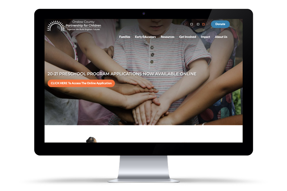
We held a website kickoff, in which we discussed the staff’s vision for the new website, as well as the challenges the public was experiencing in using the site. Based on that input, our interactive team created a timeline for a website launch and a new streamlined website architecture.
Our web designers worked on a new homepage mockup that would incorporate the new branding and offer a fresh and clean look that would be more appealing to users. They also felt that a lot of the important information on the website was buried and they wanted it to be easy to find from the homepage and navigation. The homepage design needed to make it clear that One Place’s priority was young children and setting them up for success.
WEBSITE AFTER
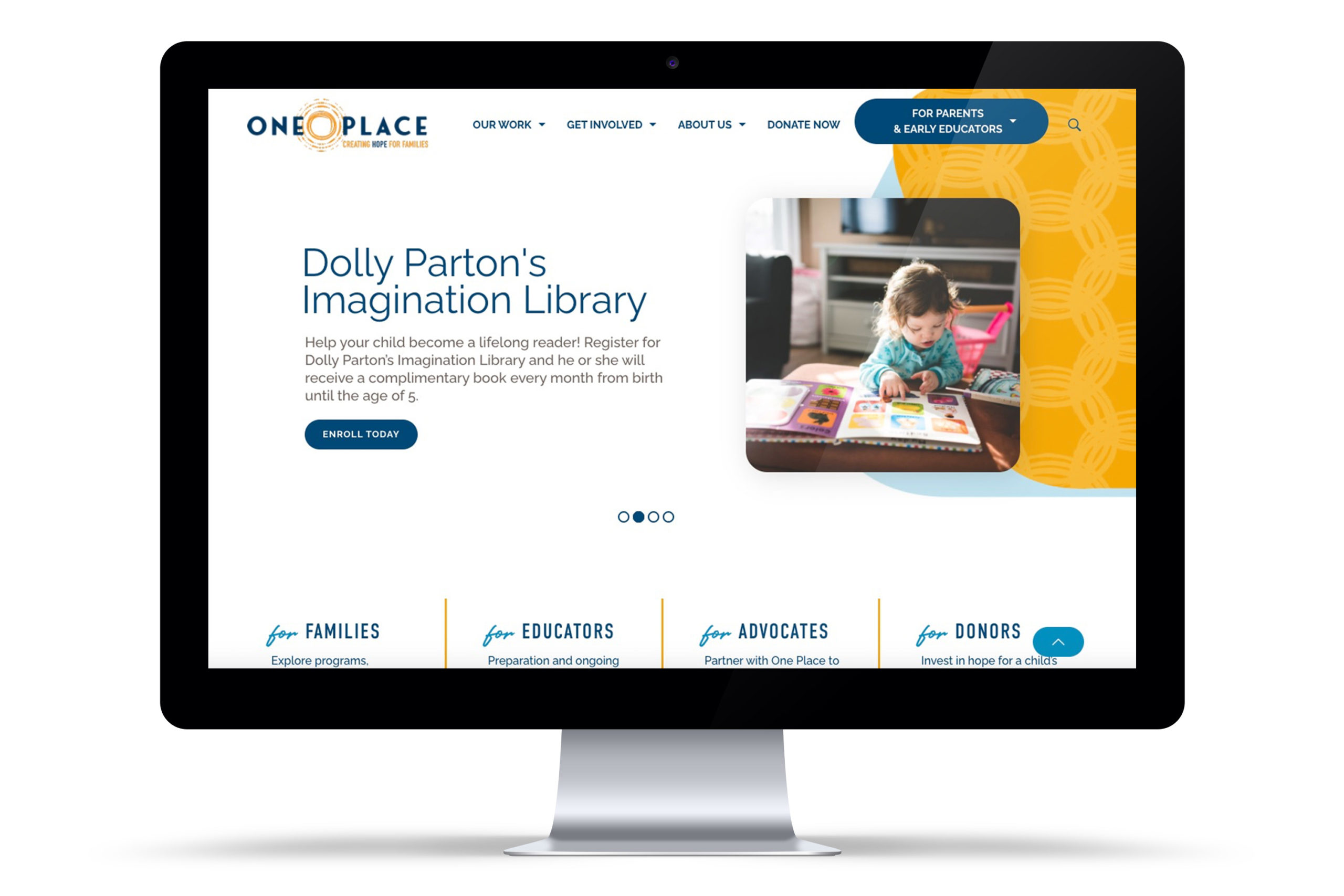
While the pages were being designed, our copywriters reworked content from the old website in consultation with the staff. Once the design of the homepage and an interior page were approved, our interactive team began building the site, which included more than 30 pages of services.
Once the website was built and approved content was input, our interactive team tested the site for usability, accessiblity compliance and mobile-friendliness before sending it to the staff for final review and approval. We launched the full site on March 1, 2021. You can see the full interactive site here: https://www.oneplaceonslow.org/.
New Brand Rollout
We coordinated the launch of the website with the announcement about the new name and brand for One Place, which also happened on March 1. This included social media posts and graphics, a press release that was sent to local media, business cards and stationery that we designed and printed in advance, and new signage. We look forward to their continued success as One Place!
“Yellow Duck was our guide through the process of rebranding from A to Z. From the initial call to our first in-person meeting, the Yellow Duck team intuitively took us through a strategic creative process. From internal organizational strategy to community input and stakeholder engagement and beyond, Yellow Duck created everything from our new name, logo design, letterhead and our newly developed website. Thanks to Yellow Duck, we were able to successfully launch our new name and brand to the community in a smooth and seamless way. We couldn’t have done it without them!” – Ann Marie Raymond, Vice President of Organizational Advancement for One Place