Branding, Case Study
Rebranding: A Case Study with Childress Klein
At some point in a company’s lifespan, there is a pivotal point where they have to reevaluate their position in their market and how their brand as a whole is portrayed. This can occur early on or after many years of experience and growth in the marketplace. Regardless of the timeframe, the result behind this consideration is the same: it’s time for a rebrand!
There are countless things to consider when facing the animal of a rebrand, but one of the most important pieces to the puzzle is to look at the current audience. Has it changed since the company’s inception? Most likely it has evolved as a result of a company’s growth or expansion, which means the focus and appearance should evolve as well.
While a brand is made up of multiple facets, the logo is the main visual promoter and typically will dictate the look and feel of brand collateral and materials, therefore it is vital to have the design locked down and approved before moving on to anything else. Fonts, colors and design elements of the logo should all be carried throughout the remaining materials, which will result in a cohesive and seamless brand package.
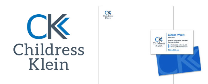
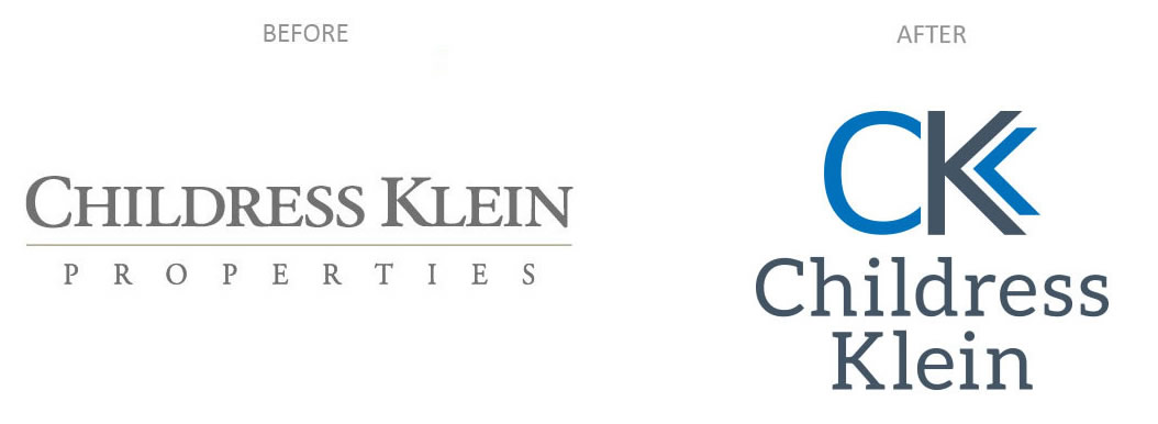
We were recently challenged with the exciting task of rebranding Childress Klein Properties, the largest commercial real estate firm in Charlotte. When we met with key internal stakeholders, they determined that their name, logo and look didn’t reflect the scope of services or scale of their company. We decided to drop Properties from their name, which opened some options to a new look for their logo.
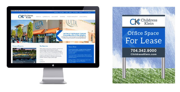
The design aspect of the project included a host of elements from stationery, marketing collateral, signage and website. Discovering their 25-year-old logo was perceived as too horizontal, subtle, traditional and bland, we made sure to provide enough variety in our new logo options. The result was a fresh, modern logo that reflects the company’s current target audience and position in Charlotte’s commercial real estate market.
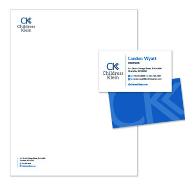
Taking elements from the updated logo was a great way to connect all the different collateral together, transforming Childress Klein into one seamless brand. The new materials pull from the two blues and create bold pops of color throughout but also allows the logo, charts and tables to be placed on a white background, which is helpful for business applications.
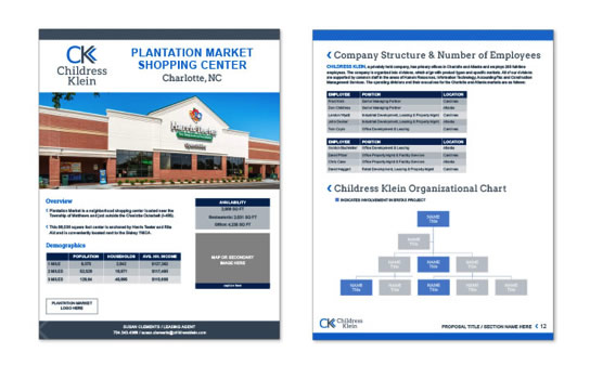
In addition to colors and fonts, we also utilized the arrow from the logo and pulled it into the stationery, website and signage as an accent, made a chevron background pattern and created a custom bullet for presentations and lists.
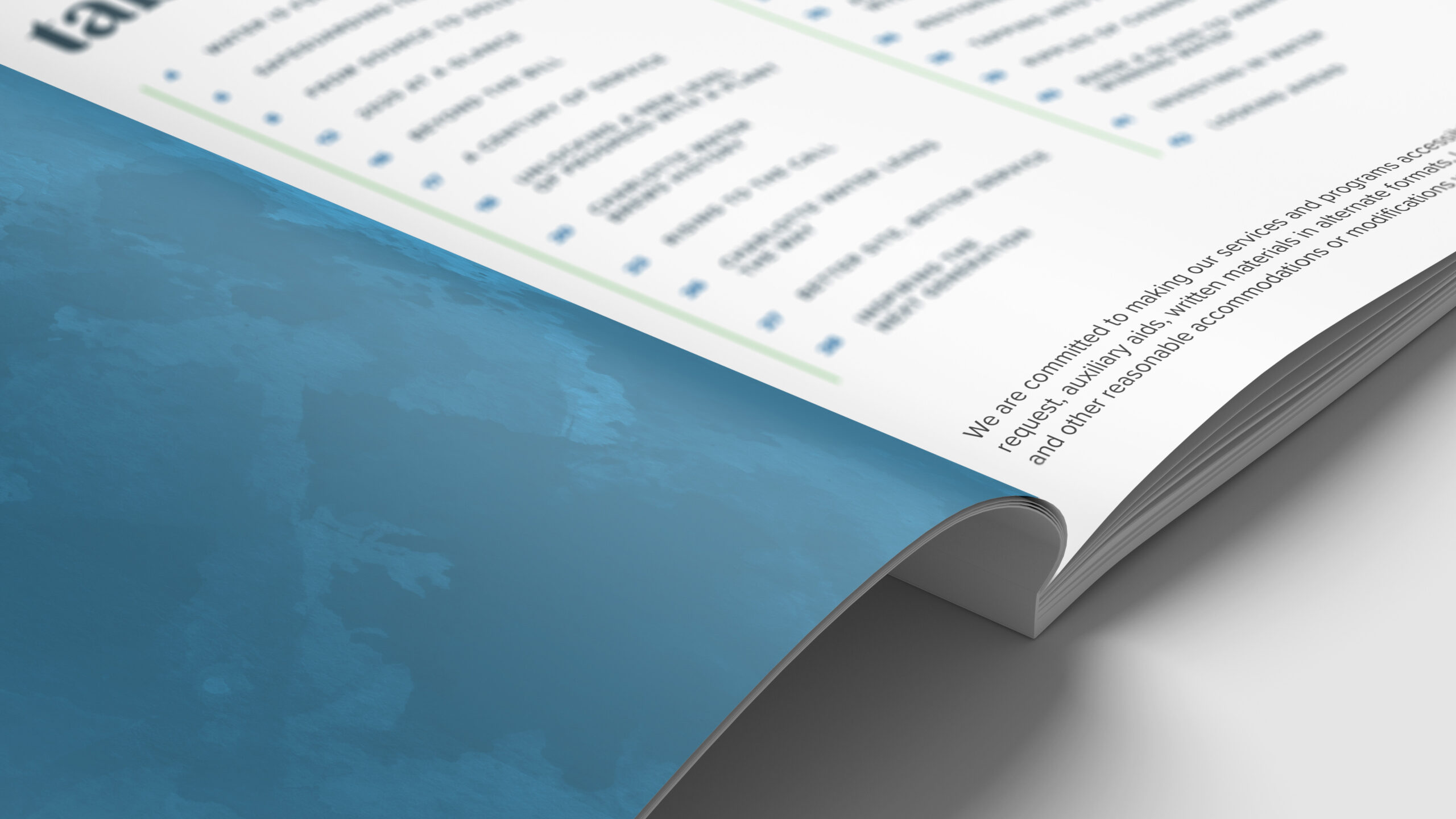
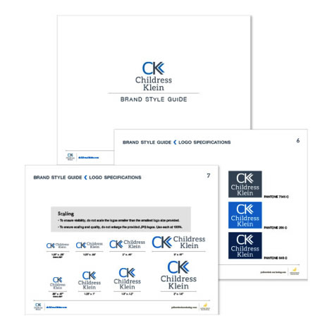
Once we’ve updated the company deliverables with the fresh, new brand, the final step is developing a brand standards document. The details of these documents are specific to each company’s needs, but they should always include instructions on proper logo treatment and approved fonts and colors. Often companies will hold a staff training to ensure the whole team is informed on how to correctly follow the new brand guidelines. This ensures that everyone will treat the brand in a uniform way and that no stone was left unturned.
The result has streamlined the Childress Klein brand identity and awareness in the market so when you study the new brand as a whole, you can clearly see that each piece belongs to Childress Klein.
Is your company ready for a rebranding? Drop us a line and let us know how we can help!