



Branding
Behind the Logo: Designing a New Identity for Brevard Philharmonic
August 26, 2026

Brevard Philharmonic was approaching its 50th anniversary, a milestone that opened a wonderful opportunity to rethink how the organization presented itself visually in today’s market.
From a design standpoint, the project posed an interesting challenge: How do you modernize something with so much history without losing what makes it feel established and authentic in the first place?
Where I Started
Before the actual logo design began, I deep dove into thinking about the visual and auditory characteristics of music and what they represent with the intent to convey something not literal for my vision. A few themes heavily inspired me to explore several different directions:
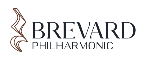
Logo A: Pause
quarter rest, silence, reflection
Rather than focusing on the literal representation of the acoustics of music, what inspired me about the quarter rest symbol was the meaning behind it: a pause between notes. It invites moments of reflection and appreciation for the spirit and history of the philharmonic.
Through the layering and movement within the symbol, it pushes away from feeling like a literal representation and toward something more artistic and powerful. Music isn’t just sound; the silence is an integral part of the composition as well.
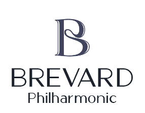
Logo B: Instrument
Monogram, instrument curves, movement
For this direction, I started with the letter B and looked at how it could become something more expressive and less expected. Playing around with fluidity, movement and curves, the shape began to remind me of the shape and sculpted craftsmanship of string instruments like violins and cellos.
Rather than illustrating an instrument outright, I wanted to capture its feeling through form. Layered outlines add movement and give the mark a sense of rhythm, connection and beauty.
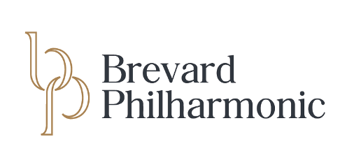
Logo C: Heritage
community, connection, refinement
This direction reimagined the organization’s existing identity through a graceful and refined interpretation. I explored bringing the B and P together into a united monogram, creating a visual connection that unites in the organization’s history and ties to the community.
The open outlined construction keeps the mark feeling light and contemporary, while the typography brings in a sense of sophistication and heritage. Modernizing an identity doesn’t always mean starting completely from scratch; you just need to find a new way to express it.
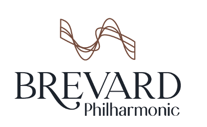
Logo D: Mountains
energy, movement, location
Inspired by beauty of the surrounding location, I explored the visual motion of sound and how that echoed the contours of the Brevard mountain ranges.
Looking beyond the literal industry themes resulted in a graceful visual that captures what makes the Brevard Philharmonic unique: a sophisticated orchestra thriving in a small mountain community.
Beyond the Logo
This project was a great reminder that modernizing a brand doesn’t mean stripping it down to something cold and stark. A brand can be both modern and traditional at the same time.
For Brevard Philharmonic, that meant striking a balance between heritage and momentum. Ultimately, the goal was an identity that could honor the first 50 years while feeling ready for what comes next and, most importantly, creating something that can grow beyond the logo itself.
Considering a rebrand for your company or organization? Reach out to us!