
Skip to content
  • Skip to primary navigation
  • Skip to main content
  • Skip to footer
Yellow Duck Marketing Yellow Duck Marketing Yellow Duck Marketing

Yellow Duck Marketing

Award-winning Charlotte marketing agency specializing in real estate, nonprofit, and municipal branding, web design, and PR. Building buzz that builds communities since 2011.

  • About
    • Meet The Ducks
    • Careers
    • Who We Work For
    • Our Blog
  • Capabilities
    • Strategy + Research
    • Branding
    • Graphic Design
    • Public Relations
    • Community Outreach
    • Websites + Digital
    • Social Media
    • Video
    • Marketing Automation
  • Focus Areas
    • Real Estate
    • Nonprofits
    • Municipal
    • Hospitality
  • Our Work
  • Contact
How we can help?
ydm logo

MAIN OFFICE

920 Pecan Avenue, Suite 100 Charlotte, NC 28205

704.271.9555

  • About
    • Meet The Ducks
    • Careers
    • Who We Work For
    • Our Blog
  • Capabilities
    • Strategy + Research
    • Branding
    • Graphic Design
    • Public Relations
    • Community Outreach
    • Websites + Digital
    • Social Media
    • Video
    • Marketing Automation
  • Focus Areas
    • Real Estate
    • Nonprofits
    • Municipal
    • Hospitality
  • Our Work
  • Contact
  • Nonprofits
  • Real Estate
  • Municipal
  • Hospitality
How we can help?
  • About
    • Meet The Ducks
    • Careers
    • Who We Work For
    • Our Blog
  • Capabilities
    • Strategy + Research
    • Branding
    • Graphic Design
    • Public Relations
    • Community Outreach
    • Websites + Digital
    • Social Media
    • Video
    • Marketing Automation
  • Focus Areas
    • Real Estate
    • Nonprofits
    • Municipal
    • Hospitality
  • Our Work
  • Contact

Behind the Logo: Designing a New Identity for Brevard Philharmonic

August 26, 2026 by Laura Wyatt

Branding

Behind the Logo: Designing a New Identity for Brevard Philharmonic

August 26, 2026

Rachel Carow
By: Rachel Carow,
Senior Graphic Designer

brevard philharmonic brand process

Brevard Philharmonic was approaching its 50th anniversary, a milestone that opened a wonderful opportunity to rethink how the organization presented itself visually in today’s market.

From a design standpoint, the project posed an interesting challenge: How do you modernize something with so much history without losing what makes it feel established and authentic in the first place?

Where I Started

Before the actual logo design began, I deep dove into thinking about the visual and auditory characteristics of music and what they represent with the intent to convey something not literal for my vision. A few themes heavily inspired me to explore several different directions:
Content creation, Content calendars, Testimonial videos, Continuous learning, Creative excellence

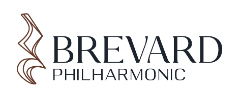
Logo A: Pause

quarter rest, silence, reflection

Rather than focusing on the literal representation of the acoustics of music, what inspired me about the quarter rest symbol was the meaning behind it: a pause between notes. It invites moments of reflection and appreciation for the spirit and history of the philharmonic.

Through the layering and movement within the symbol, it pushes away from feeling like a literal representation and toward something more artistic and powerful. Music isn’t just sound; the silence is an integral part of the composition as well.
Brand guidelines, Brand refresh, Landing page design, Animation services, Best graphic design agency

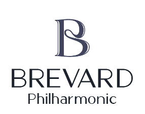
Logo B: Instrument

Monogram, instrument curves, movement

For this direction, I started with the letter B and looked at how it could become something more expressive and less expected. Playing around with fluidity, movement and curves, the shape began to remind me of the shape and sculpted craftsmanship of string instruments like violins and cellos.

Rather than illustrating an instrument outright, I wanted to capture its feeling through form. Layered outlines add movement and give the mark a sense of rhythm, connection and beauty.
Media relations, Video production, Nonprofit marketing, Best graphic design agency, Nonprofit website award

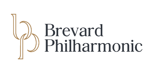
Logo C: Heritage

community, connection, refinement

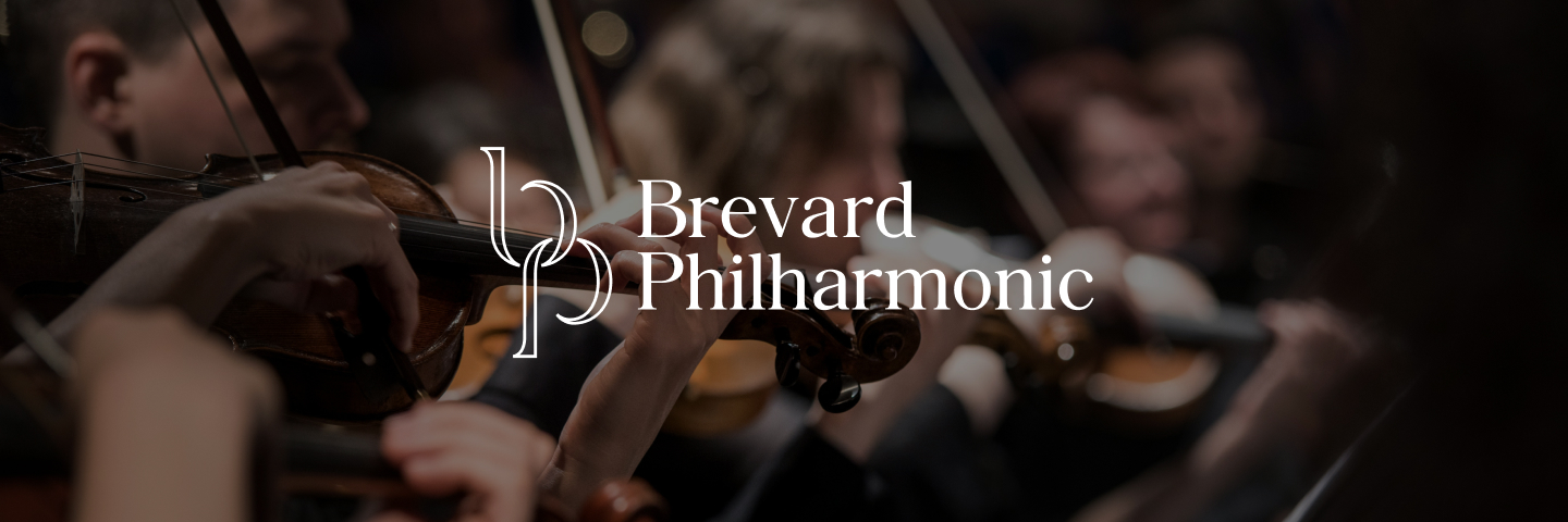
This direction reimagined the organization’s existing identity through a graceful and refined interpretation. I explored bringing the B and P together into a united monogram, creating a visual connection that unites in the organization’s history and ties to the community.

The open outlined construction keeps the mark feeling light and contemporary, while the typography brings in a sense of sophistication and heritage. Modernizing an identity doesn’t always mean starting completely from scratch; you just need to find a new way to express it.
Typography design, Event videography, Tourism promotion, Best website design, NC State Stars Award

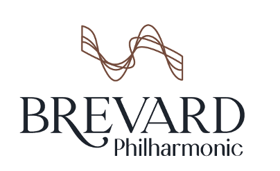
Logo D: Mountains

energy, movement, location

Inspired by beauty of the surrounding location, I explored the visual motion of sound and how that echoed the contours of the Brevard mountain ranges.

Looking beyond the literal industry themes resulted in a graceful visual that captures what makes the Brevard Philharmonic unique: a sophisticated orchestra thriving in a small mountain community.

Beyond the Logo

This project was a great reminder that modernizing a brand doesn’t mean stripping it down to something cold and stark. A brand can be both modern and traditional at the same time.

For Brevard Philharmonic, that meant striking a balance between heritage and momentum. Ultimately, the goal was an identity that could honor the first 50 years while feeling ready for what comes next and, most importantly, creating something that can grow beyond the logo itself.


Considering a rebrand for your company or organization? Reach out to us!

Share this post

You may also like…

communications with apartment residents, updating residents, PR

Consumer Behavior, Marketing Strategy, Real Estate

How to Keep Apartment Residents Informed Without Overwhelming Them

Consumer behavior, Brand refresh, Community engagement, Thought leadership, Storyboarding

Consumer Behavior, Digital Marketing

5 Marketing Trends Defining 2026

Brand guidelines, CMS integration, Municipal branding, Infrastructure marketing, Tourism promotion

Community Engagement

Beyond the Public Meeting: How Municipal and Utility Organizations Can Build Lasting Community Engagement

Landing page design, Mobile-first design, Event videography, Best graphic design agency, Nonprofit website award

Case Study

Landscape Management Native Seed Packets

Brand positioning, Audience insights, Brand refresh, Stakeholder communication, Hospitality marketing

PR

Flip the Script: Why PR Matters More Than Ever in the Age of AI

Strategic planning, Video content, Video production, CRM integration, Community involvement

Market Research, Web Design

GEO vs SEO: Why Your Content Needs to Impress AI Now

Filed Under: Branding

Footer

Logo design, Color palette development, CMS integration, Paid social campaigns, Client-first approach

CONTACT US

920 Pecan Avenue, Suite 100
Charlotte, NC 28205

704.271.9555

Go-to-market strategy, Landing page design, Video content, Behavioral targeting, Creative innovation
Print collateral, Scriptwriting, Tourism promotion, Community involvement, NC State Stars Award

Strategy + Research

Branding

Graphic Design

Video / Production

Web + Digital

Social Strategy

Public Relations

REAL ESTATE

Nonprofit

Municipal

Hospitality

Careers @ YDMOur Blog

CONNECT

facebook instagram pinterest linkedin youtube

Keep up with the ducks through our quarterly newsletter!

Copyright 2025 YDM | Privacy Policy Accessibility

  • Nonprofits
  • Real Estate
  • Municipal
  • Hospitality