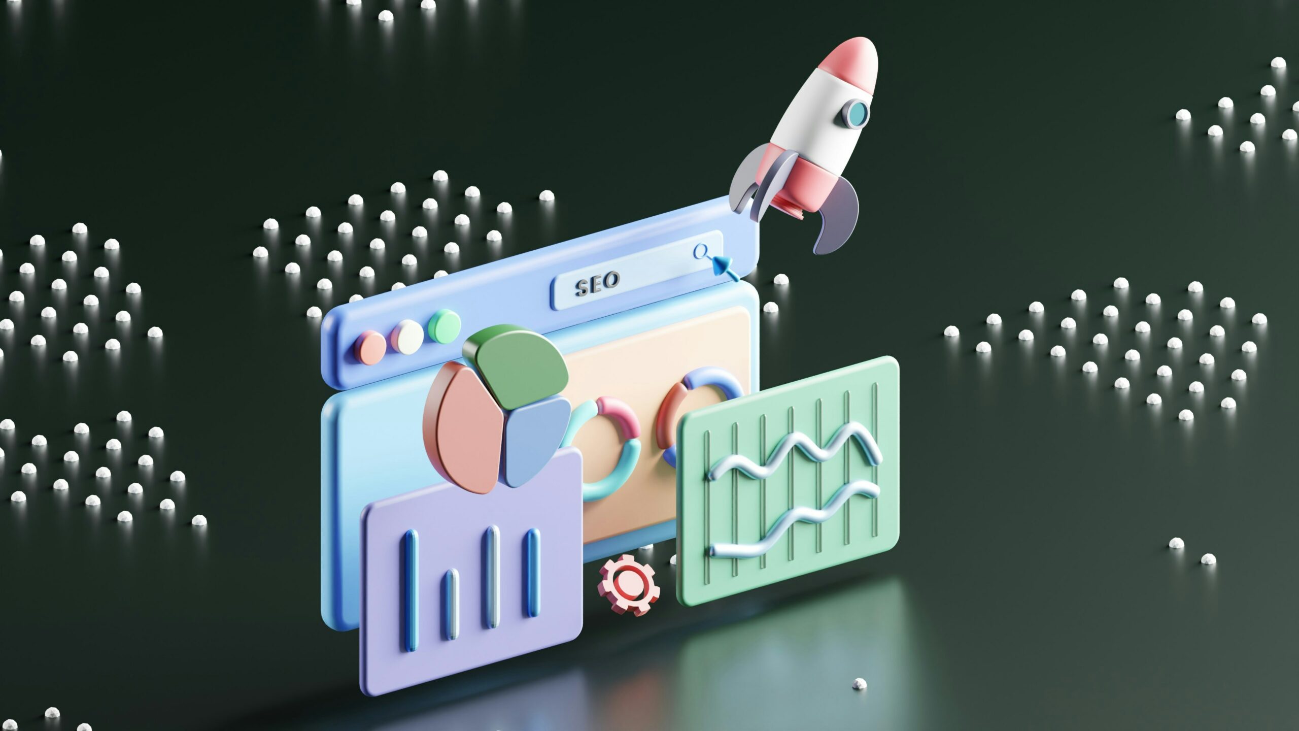
Branding, Company News
Behind the Scenes – YDM Logo Development
Corporate rebranding is an exciting – and sometimes complicated – process for any business or organization. After using the same logo for many years, or even decades, reimagining a company’s public image isn’t a speedy process. It involves thoughtful discussions among stakeholders, industry research, concepting, developing and getting input throughout the process.
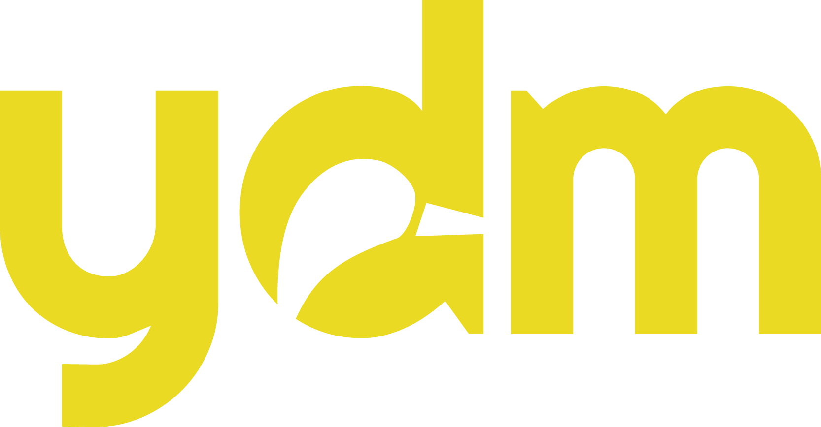
We’ve walked many clients through corporate rebrandings and this year, after using the same logo since Yellow Duck Marketing was founded in 2011, we decided it was our turn.
Moving to a new home pond in Plaza Midwood made it an ideal time to rebrand Yellow Duck Marketing with a new look. The logo development and redesign process took on a whole new meaning. This time it was personal.
Discovery
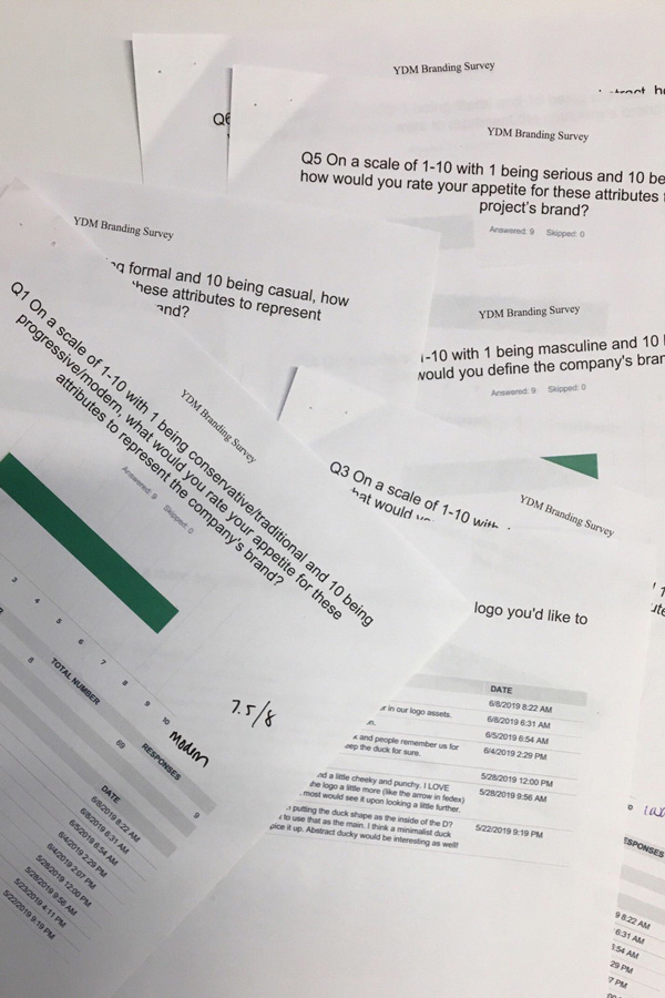
Each member of the team gave their input in an online survey asking questions like how modern/conservative, serious/playful and literal/abstract the logo should be as well as the opportunity to share any thoughts and prefaces they had. We knew that we wanted an iconic mark that was fun but elevated, showed progress and action.
The results gave a great baseline for everyone’s vision for the rebrand and how far they wanted to take it. The results revealed the duck, colors and fonts all needed some love to be modernized and elevated and that a brand marker was a must. So, we got quackin’!
Brainstorm and Concept Development
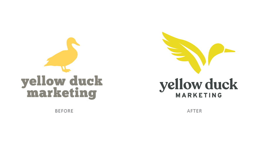
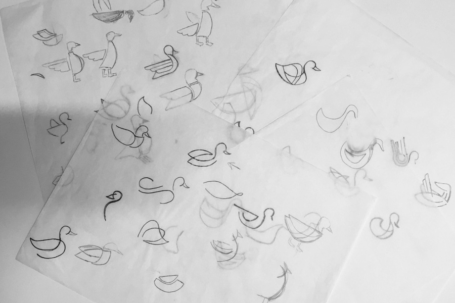
Because our name is Yellow Duck Marketing, we knew the duck would remain as the icon in some way, but other than that, the world was wide open for change. The first round of sketching took into account two concepts from the brand discovery: one, ducks paddle hard and furiously under water but are calm, cool and collected on top just as we are as marketers and two, we are not a one-stop-shop and are with our clients from the beginning and hold our relationships very strongly.
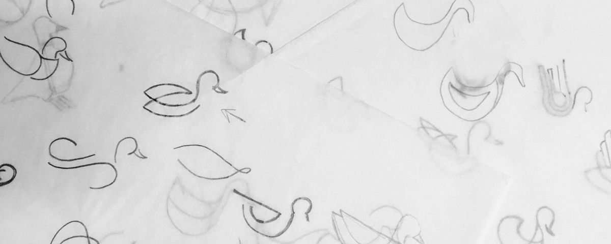
Sketching and Design Execution
The first logo batch gave a range of ideas that could be expanded upon – singular lines that convey our seamless process, layering shapes to show our variety of services and utilizing silhouettes to create the new duck icon.
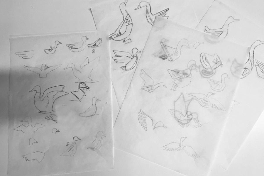
The top two concepts were fine-tuned and put up for an internal vote. After some reflecting, the concepts just weren’t quacking back the way we hoped. It was time to take the pencil back to the paper to sketch again. We reconvened on what the duck represented and what this new brand message should be such as taking flight and creating forward movement. Julianne revealed that negative space and energy were the two themes that seemed to take charge. The sketches were presented, and her favorites were marked to then take into vector.
Logo Presentations
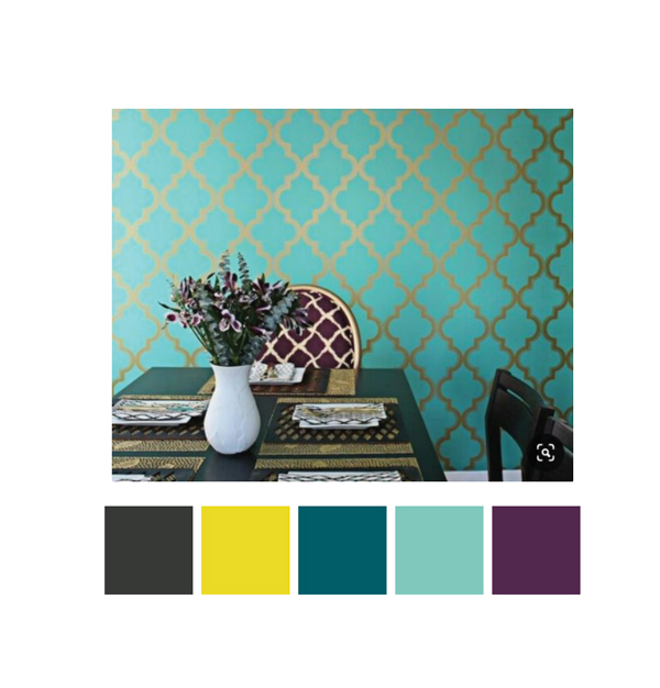
Once the final logo was selected, it went into colorization, where we established an accompanying color palette and brand marker. The new brand yellow feels powerful, happy and fresh and pairs perfectly with the rich accent colors.
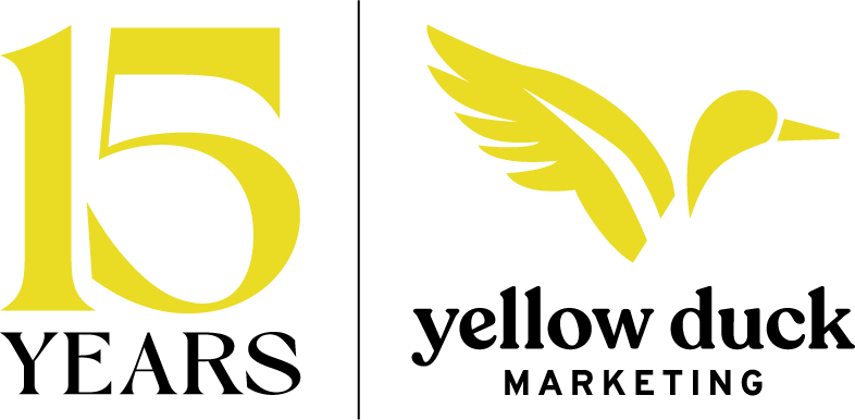
Final Logo