Branding, Graphic Design
Print Isn’t Perfect: Designing with ADA in Mind
April 15, 2026

Accessibility in design has moved from a niche consideration to an industry expectation. And while most of the formal ADA framework was built around digital experiences and physical built environments, print collateral doesn’t get to opt out of the conversation.
At Yellow Duck Marketing, we approach accessible print design not as a compliance checklist, but as one important lens in a larger set of design decisions. Print is static — no screen readers, no zoom, no contrast toggle — which means the choices made before something goes to press are the only ones that matter. But those choices also must account for the client’s brand, their audience, their budget and what the piece needs to accomplish. Accessibility informs our thinking, but it doesn’t override everything else.
Here’s how we think about accessibility-conscious design for brochures, flyers, signage and collateral, and how we balance it with everything else a great piece needs to do.
Typography: Size, Weight & Readability
Most readability challenges in print come down to type. Font size, weight, spacing and typeface selection all affect how easily someone can move through content, particularly readers with low vision, dyslexia or age-related changes. We keep these considerations in the room when we’re making decisions, even when a client’s brand or design direction pulls in a different direction.
The factors we’re always weighing:
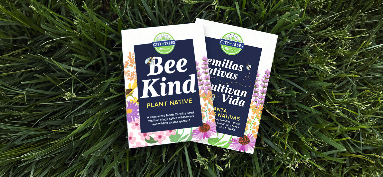
- Font size relative to audience: A younger demographic on a high-end editorial piece is a different conversation than a senior living community brochure. Is this a piece that is for all of the public?
- Typeface legibility versus brand personality, and where those two things can coexist
- How letter spacing, line height and weight choices hold up once ink hits paper
- When all caps, ultra-lights or decorative fonts are worth the tradeoff, and when they’re not
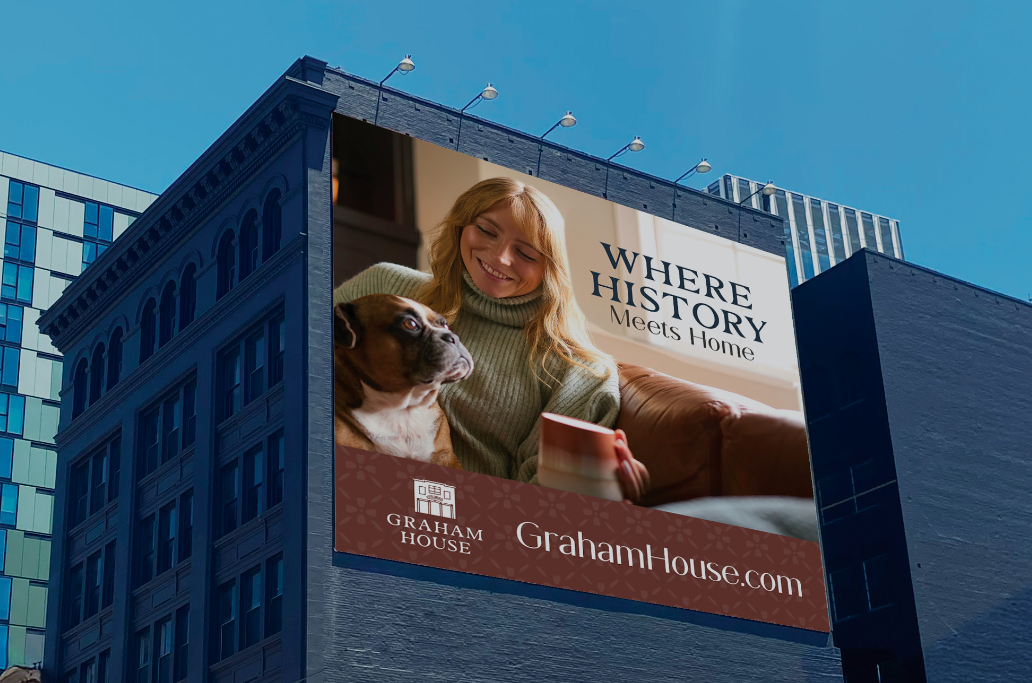
Color Contrast & Visibility
What reads beautifully on screen doesn’t always translate the same way on paper. Ink density, paper stock and real-world lighting all affect contrast in ways a monitor preview won’t catch. Low contrast is one of the most common accessibility gaps in print. It’s also one of the easier ones to address without compromising a design, if you’re paying attention early enough in the process.
The factors we’re always weighing:
- Whether a palette that feels on brand will still hold up on coated versus uncoated stock
- How to handle text over photography in a way that serves both the visual and the reader
- Color blindness considerations and how to use secondary cues so meaning isn’t lost
- When a low-contrast choice is a deliberate, informed decision versus an oversight
Hierarchy & Layout
Strong hierarchy is good design, not just an accessibility feature. A well-organized layout guides any reader through a piece more effectively, and it’s especially important for readers with cognitive or visual challenges. The tension we navigate most often here is between a client who has a lot to say and a format that has limited space to say it.
The factors we’re always weighing:
- How much content needs to live in this piece and how to prioritize ruthlessly when there’s too much
- Layout structures that feel intentional and editorial rather than just “accessible”
- How to create emphasis through size, weight and placement so the hierarchy works even when color can’t carry it
- Where density serves the design and where it creates unnecessary friction for the reader
Details That Get Overlooked
Paper finish, fold placement and the actual environment where a piece will be read are factors that don’t always make it into the early design conversation, but they should. A glossy finish can create glare that undermines an otherwise readable layout. A fold in the wrong place can interrupt a headline or break a call to action across panels. And a flyer that’s going to be read quickly at a busy event table has completely different needs than a mailer someone takes home and reads at their desk. We try to design for the real context, not the controlled one.
When Full Conformance Isn’t Optional
For most clients, ADA-conscious design is about making thoughtful tradeoffs. But for municipalities, government agencies and public-facing organizations, the bar is higher — and in some cases, legally mandated.
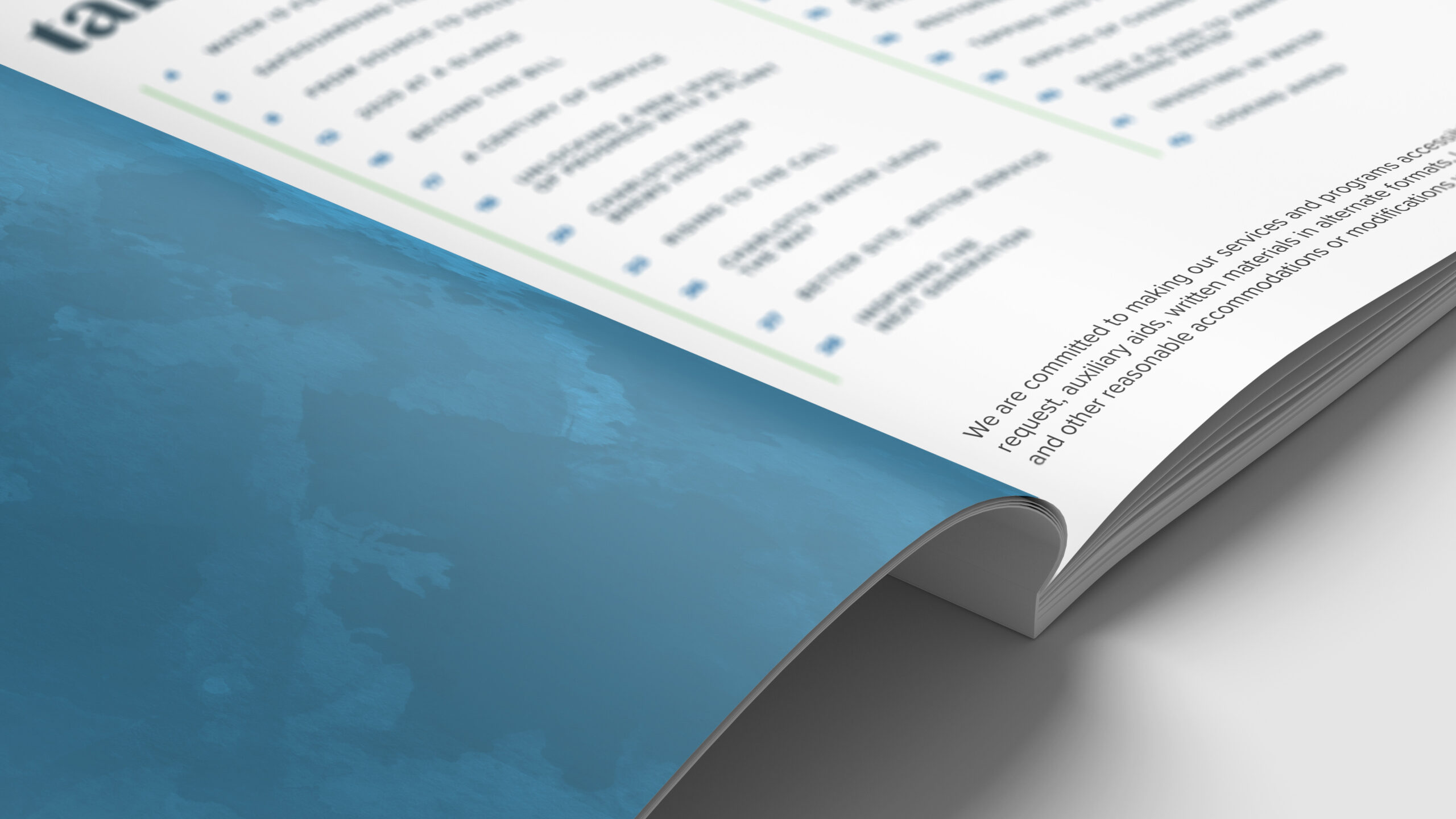
A 2024 ruling by the Department of Justice clarified that Title II of the ADA applies to the digital and print communications of state and local government entities. That means public agencies can’t treat accessibility as optional — their materials need to be designed with conformity in mind from the start. We work with municipal clients who are navigating exactly this, and our approach there is different: less about weighing tradeoffs, more about building the most accessible version of a piece the format will allow.
We’re not lawyers, and we don’t take on legal compliance responsibility on behalf of our clients. But we do bring the knowledge, process and design sensibility to help public entities produce materials that reflect ADA conformity principles as closely as the medium allows.
Accessible Design Isn’t Boring Design
The biggest misconception we run into is that designing with accessibility in mind means defaulting to something safe, generic or flat. It doesn’t. Some of the most beautiful, high-impact print work we’ve produced has also been among the most thoughtfully accessible — good design and clear communication aren’t in conflict. The key is knowing where there’s room to push and where a different call serves the audience better.
We make those calls in conversation with our clients, not in spite of them. The goal is always a piece that reflects the brand, reaches the audience and holds up in the real world — wherever that happens to be.
Print may never be fully ADA conforming the way a WCAG-audited website can be. But “can’t be perfect” isn’t the same as “don’t try.” The brands, developers and organizations we work with are asking better questions: Who is this for? Will everyone in our audience be able to engage with this? Are we unintentionally designing people out of the conversation?
Good design communicates. Great design communicates to more people.
Working on print materials and want a team that thinks about the full picture? Reach out to us — we’d love to help.