Graphic Design
The 2026 Color Trends Redefining Visual Culture
January 27, 2026

Color has the power to tell stories and evoke emotion, shaping mood and meaning across fashion, photography, print, digital design and interior spaces. No matter the medium, color connects us to our environments and to each other, influencing how we experience and remember what we see.
Here are some of the standout color trends shaping visual culture in 2026.
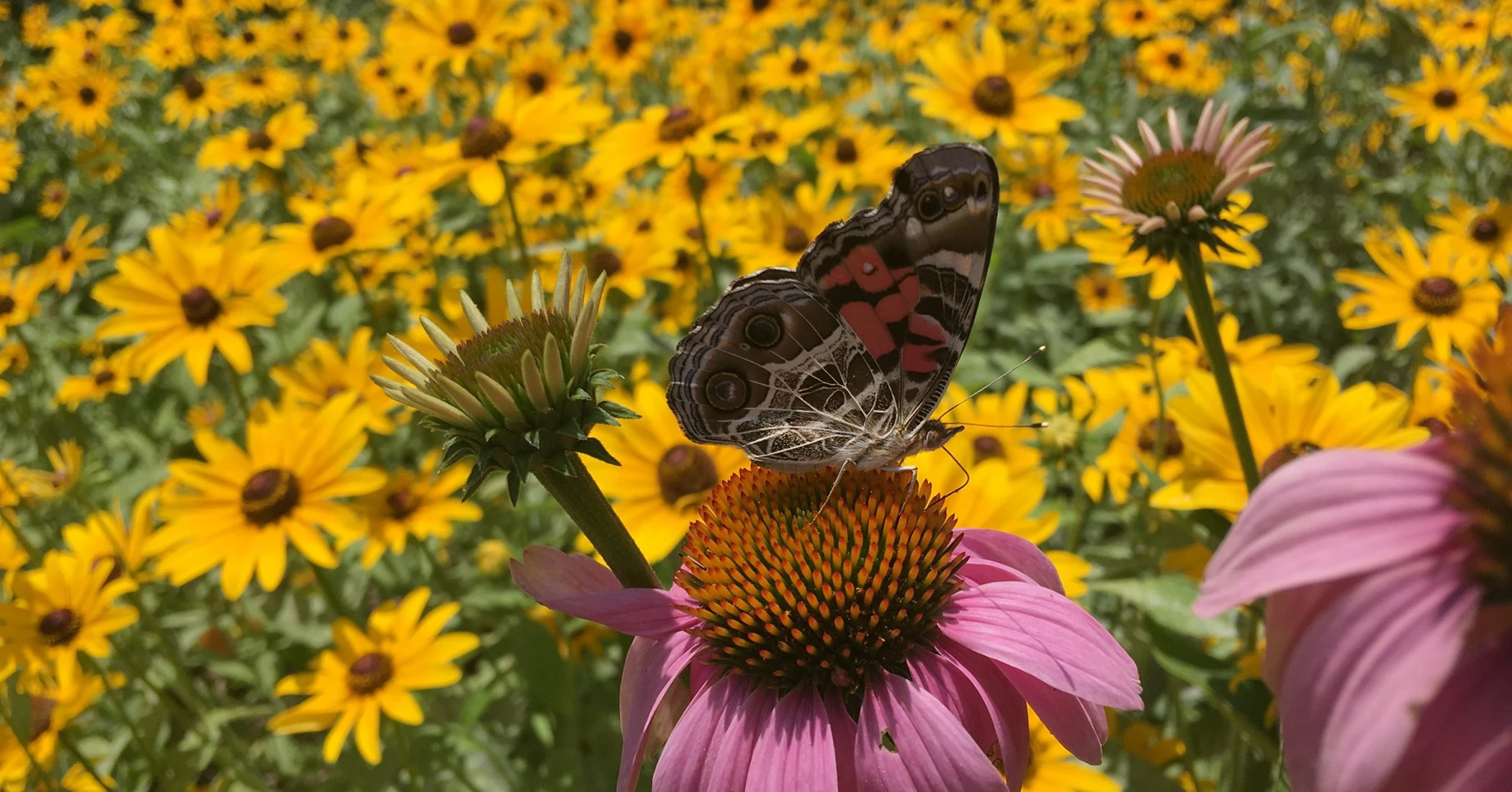
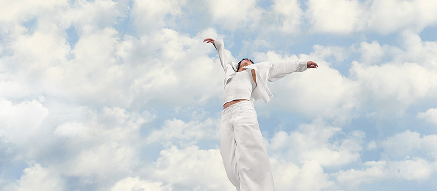
Cloud Dancer
In a world defined by saturation and visual overload, Pantone’s 2026 Color of the Year embraces restraint. PANTONE 11-4201 Cloud Dancer is a soft, weightless white created to bring clarity, calm and renewal. As audiences seek deeper human connection and more authentic experiences, Cloud Dancer strips away excess, allowing simplicity and intention to take center stage. With subtle warmth beneath its surface, it feels welcoming rather than stark, guiding design away from noise and toward authenticity, imperfection and quiet confidence.
 Source: Pantone
Bioluminescence
Advances in AI and digital tools have reshaped how visual spaces are imagined and built. Bioluminescent color reflects this shift, blending gradients with depth, glow, and a sense of fantasy. What once felt flat now feels immersive, pulling viewers into dreamlike environments that blur the line between digital and emotional experience. Moving away from neutral minimalism, this approach invites exploration and imagination, using color to transport rather than simply decorate.
Source: Dribble
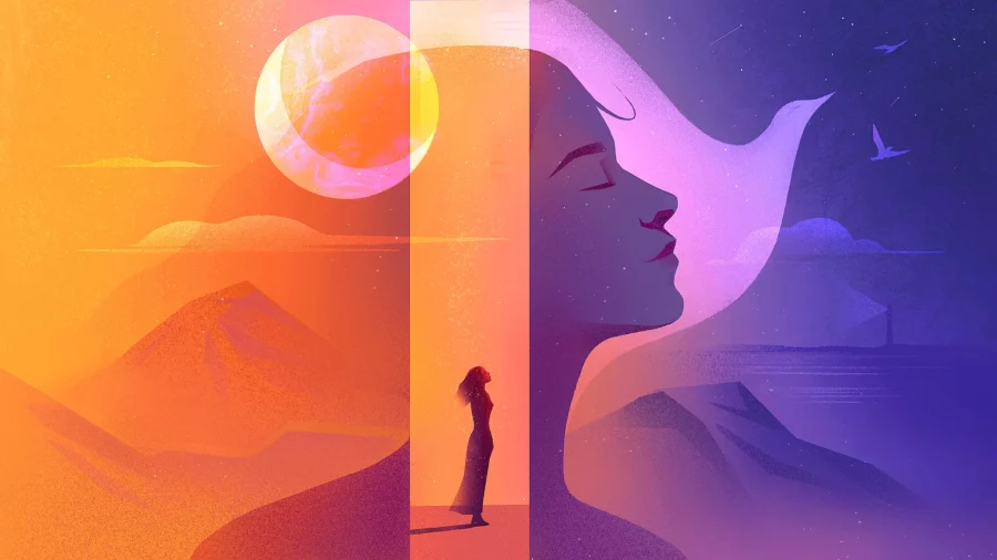
Emotional Color
Rather than chasing hyper-polished digital perfection, color is taking on a more expressive, human role. It moves beyond surface-level aesthetics to become an emotional language, shaping atmosphere, mood and depth with intention. Texture and warmth replace polish for polish’s sake, allowing color to feel lived-in rather than manufactured. The most resonant work slows people down, sparks feeling and creates space for genuine connection. When color leads with emotion, it leaves an impression rooted in memory rather than spectacle.
 Source: Dribble
Ambient Glow Gradients
Gradients have evolved from high-impact neon statements into softer, more atmospheric tools. Pastel blends, smoky transitions and deep fades introduce cinematic depth without overpowering content. Used like ambient light, these gradients add warmth and dimension across digital environments. Subtle glow effects appear not only in backgrounds, but within interface details, gently guiding attention while maintaining restraint. The result feels immersive, modern and quietly refined.
 Source: Dribble
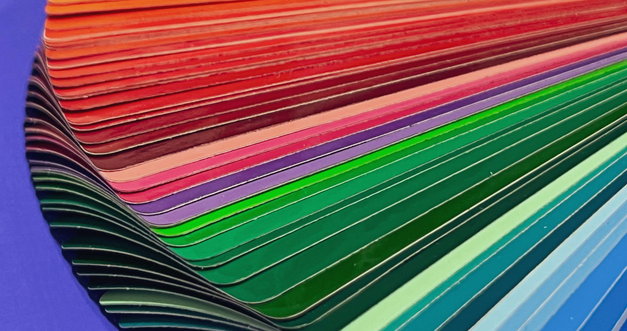
The Return of Bold Color
After years of muted palettes and near-neutral tones, bold color is reclaiming its place. Vibrant hues bring optimism, confidence and personality back into focus, offering joy without excess. Influences from fashion, film and culture have reframed saturation as expressive rather than overwhelming. High-contrast pairings, jewel tones and unexpected combinations create visual energy that feels intentional and self-assured. Color shifts from playing it safe to making a statement.
 Source: Dribble
Color With Purpose
While opinions continue to circulate about which color trends are worth following, the underlying message remains clear. The most meaningful work comes from creators who prioritize free expression and emotional honesty over rigid formulas. Trends may offer direction, but they are not the destination. When color is used intuitively and with intention, it becomes a tool for connection rather than conformity. The strongest work reflects the creator’s voice, inviting others to feel something real.