
Web Design
Conversion Killers: What’s Haunting Your Website
September 9, 2026


You’ve paid the money for a beautiful and functional website. It’s showing up in search and getting traffic, but according to recent research, the average website loses 67% of visitors before they reach a conversion point, and it’s not showing up in your bottom line with your leads. Scary! Continue reading to find out a few clues as to what may be haunting your website conversions.
Not Enough CTAs or No CTAs
We’ve audited sites where visitors reach the bottom of the page and vanish like ghosts not knowing what action you want them to take. Your CTA (call to action) buttons should be clear, visible and positioned where users naturally look (above the scroll is a great start). Multiple CTAs throughout the page work well because visitors need the option to reach out the instant they’re ready, not when they finally find your form buried at the bottom of your page.
Too Many CTAs or No Clear Direction
The opposite problem shows up just as often: too many competing options create decision paralysis. When we audit sites with five or six different CTAs on one page, visitors get caught in a haunted house of choices, clicking nothing and leaving instead. A clear primary path or choice works better than endless options. One main CTA per section removes the friction and makes the next step more obvious.
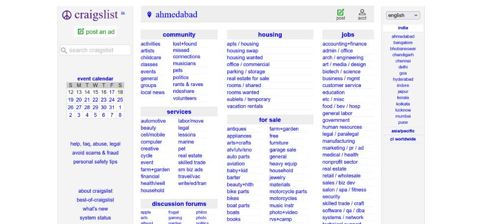
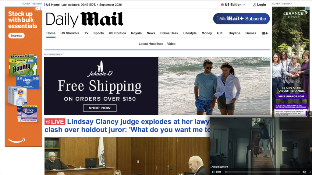
Too Much Visual Clutter
When we audit sites with too much going on, we see visitors get spooked and leave. Clean designs with a visible CTA in a refined, accessible color palette make it obvious where to click next. Every element on the page should help influence your conversion goal. If it doesn’t, it’s probably working against you by adding noise.
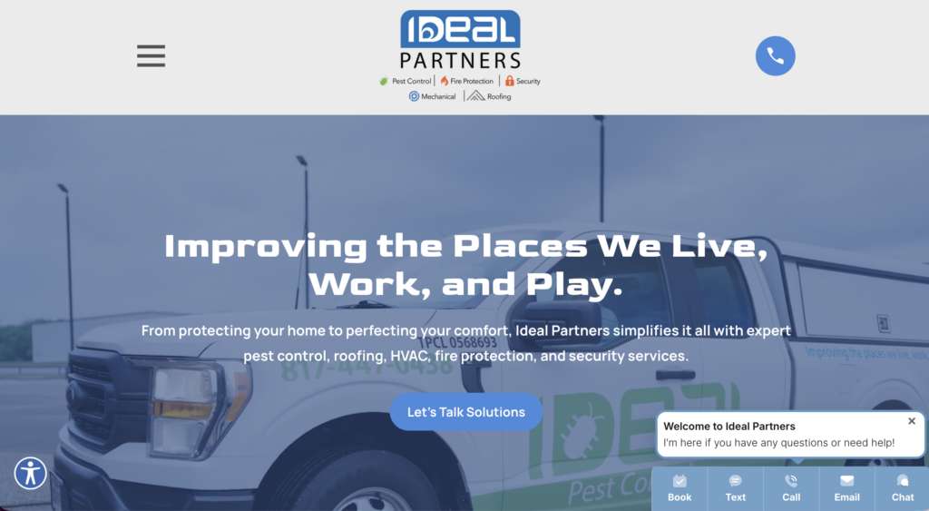
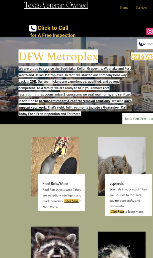
Vague Content and Headlines
If visitors don’t understand what service you offer within the first few seconds, they vanish like a ghost from your site and possibly to a competitor. Research shows users form initial impressions in milliseconds. Clear headlines matter for everyone, but especially for visitors using screen readers or skimming quickly on mobile. Vague messaging forces users to work harder to understand your value, and most won’t stick around to do the work. Authentic copywriting that speaks directly to your audience’s needs builds trust from the beginning.
Conversion Form Is Too Complex or Too Long
We see form abandonment rates hit 81% when you’re asking too much upfront. The reason being that every field you add reduces the likelihood that your user will have the patience to complete the form. Research performed on over 400 landing pages shows that one-field forms convert at 18.2%, but add a second field and you drop to 13%. By the time the form is at five fields, you’re at 8.1%. Nine or more fields? Down to 4.2% — scary!
People have less time than ever, and a long form signals that you’re going to waste it. Start with a short form focused on what you actually need to know. Use conditional logic to show follow-up questions only when it’srelevant and essential. Collect the rest of this information through follow-up conversations or emails after they’ve already committed. Expedia tested this by removing just one confusing field from their booking form and saw a significant increase in conversions. Sometimes less is more.
Website Isn’t Mobile-Friendly
More than half your traffic is likely mobile. If your site isn’t easy to use on a mobile device, your analytics dashboard will look more like a ghost town (empty). Over 53% of mobile visitors abandon sites that take longer than three seconds to load. Your CTA button should be visible above the scroll, not buried. An ideal contact form should be extremely short and allow autofill from the user’s phone. Mobile accessibility isn’t just about speed. It’s about button sizes that work for everyone, readable text without zooming and simple navigation.
Missing Credibility
Visitors also leave sites when they have no reason to believe you can help them. Trust is earned through social proof. Testimonials, reviews, case studies and examples of your previous work show visitors you can accomplish what you promise. Research from Stanford shows that 75% of users judge credibility based on website design and content alone.
Slow Loading Time
A slow site, moving at zombie speed, frustrates visitors and is a definite sign of poor quality. Speed isn’t a nice-to-have, it’s a necessary part of your user experience. Your competitors are one “back” click away, and if your site is slow, visitors will go there instead. Optimize for fast loading across all devices.
If any of these sound familiar, your site might be haunted with these conversion killers, leaving sales, leases and opportunities on the table. Reach out to us for a website audit. We’ll identify what’s haunting your bottom line and put these ghosts to rest.
Sources:
- https://medium.com/@PlatoForms/event-registration-form-abandonment-4-ways-to-increase-conversion-rates-16fd633e46f6
- https://medium.com/@robert_86334/the-silent-customer-exodus-why-67-of-visitors-abandon-your-website-within-seconds-70f270bdd822
- https://neilpatel.com/marketing-stats/conversion-rate-by-form-fields/