Company News, Graphic Design
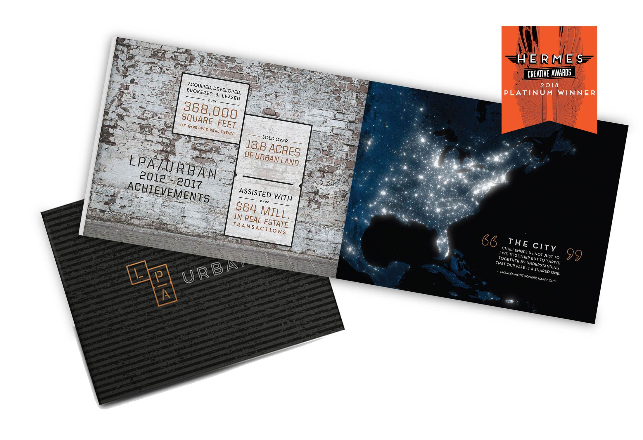
LPA Urban look book wins Hermes Award

There was some excited quacking at the Duck Pond when we learned our Art Director Rachel Carow’s work on an LPA Urban look book earned the 2018 platinum prize in the Hermes Creative Awards competition!
The international Hermes Creative Awards honors creative professionals who have done exceptional work conceptualizing, writing and designing print media, advertisements and public relations materials, as well as electronic, social and interactive media projects. Administered and judged by the Association of Marketing and Communication Professionals, the competition receives submissions from media conglomerates and Fortune 500 companies, so the ducks had plenty of healthy competition!
Rachel designed a look book for LPA Urban, a boutique arm of Charlotte-based Lat Purser & Associates that specializes in commercial real estate within urban areas. Because the project was urban and lent itself to a gritty feel, Rachel thought a lot about the textures of cities and spent time exploring graffiti art and billboards before she began her work.
“This project was a little outside the box, so winning this award will help me guide future clients to new heights in terms of design,” she said. “I can show them what we’re capable of because my designs can go as far as the client is willing to go.”
Starting with only LPA Urban’s logo for inspiration, Rachel worked on incorporating its brown boxes into the look book and focused on selecting backgrounds featuring things like brick patterns since long stretches of bricks walls are a common city feature.
“I needed to convey that this was about experiential retail and help people feel like they were in unique places while highlighting human social connection,” Rachel said. “The images I chose all showed the liveliness of these places – people hanging out at outdoor cafes or walking down streets chatting.”
Rachel also oversaw Motion and Graphics Designer Kay Everatt’s design of a new logo for The Quinn Apartments, a complex run by Abacus Capital Group in Las Vegas, Nevada. The bold blue, burnt orange and black logo creates a layered feel and won an honorable mention in the Hermes Creative Awards.
“They wanted to evoke thoughts about the Vegas strip and its lights but in a modern, cool and tasteful way,” Rachel said. “The goal was to be different but certainly not cheesy.”
She added that it’s always helpful to obtain a lot of information from the client before she begins her work. Rachel prefers to see photos of a property, understand a client’s target market and think through questions of scale, like how modern or traditional the client envisions its brand. She also researches the brand’s competition and makes sure any logo she approves or designs fits with the architecture of the place.
“This type of work is very subjective, so achieving something that makes both you and the client happy is special.” Rachel said. “I loved that these projects were both in alignment with my original creative vision.”
Stay tuned for a post coming soon about our award-winning web design project for Catawba Lands Conservancy!