Company News
Ducks Sweep 2021 MAME Awards

Another cause for celebration – the ducks had a clean sweep of the 3 categories we were entered in for the Homebuilders Association of Greater Charlotte’s Major Achievement in Market Excellence (MAME) Awards! Our team brought home the Gold in the categories of Best Website and Best Brochure for Revolve Residential’s Atlas Urban Homes and Best Logo for Hopper Communities’ Uptown West Terraces (Atlas was a finalist). Click here for more info.
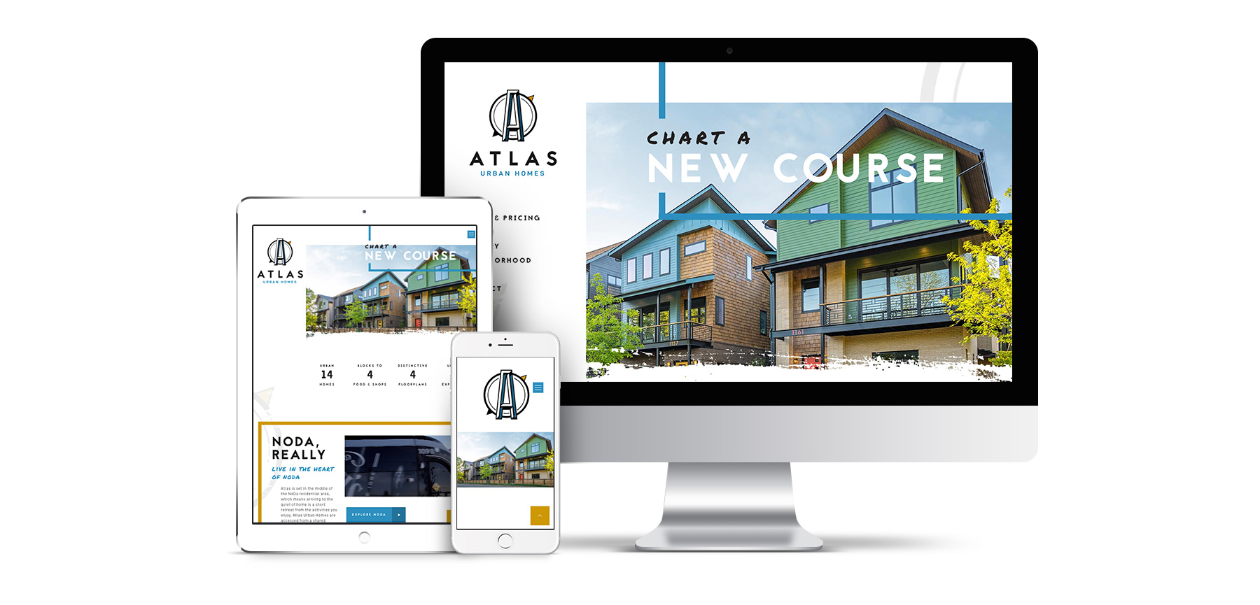
Best Website Design
The website for the “Community of the Year” Atlas Urban Homes was designed for Revolve Residential with the creative, innovative buyer in mind. Our designers’ primary objective was to translate the brand and its vibrant messaging through an easy-to-use web interface that translated well to mobile devices since we knew primarily people view on mobile. In doing so, the result was a compact but impactful brochure website to be used as an online sales tool for the new homes sales team.
The “meat” of the website sandwich on the Homes & Pricing page includes an interactive site plan with live inventory allowing real-time pricing that assisted the developer to raise prices of the homes as the project progressed. Due to the complexity of the project with prescribed plans on each lot, it was important to show the assigned lots for each of the floorplans for clarity along with their specific pricing and color home.
The pricing table hyperlinked the anchor tags to the associated floorplan to jump a user down to the right part of the page that details each floorplan. Each floorplan section detailed selling points of each home plan, statistics, and oversized thumbnails of the 3D floor plan’s three floors that popped up to a lightbox, as well as downloadable floorplan dimensions. Below those it showed thumbnails of the various paint colors each model is offered in by lot and a recap of the siteplan with that particular model’s lots highlighted.
In addition to highlighting the unique design features of each plan, the “special sauce” of the site features an interactive slider module to allow the user to “try on” the three interior finish packages so people could move the sliders to see the bathroom in the 3 different tile/cabinetry colors.
Other features include a gallery showcasing impressive photography of the completed project once the first homes were able to be photographed, a video tour of the NoDa neighborhood as well as a neighborhood map with points of interest for the vibrant neighborhood, and a page to introduce the builder, contractor and design teams. The vibrant interactive and mobile-friendly website helped assist the team in completing their sales goals prior to the completion of the project and see sales price increases ahead of proforma.
You might recall this wasn’t the first Best Website trophy we took home: Revolve’s Domain Townhomes won in 2019!
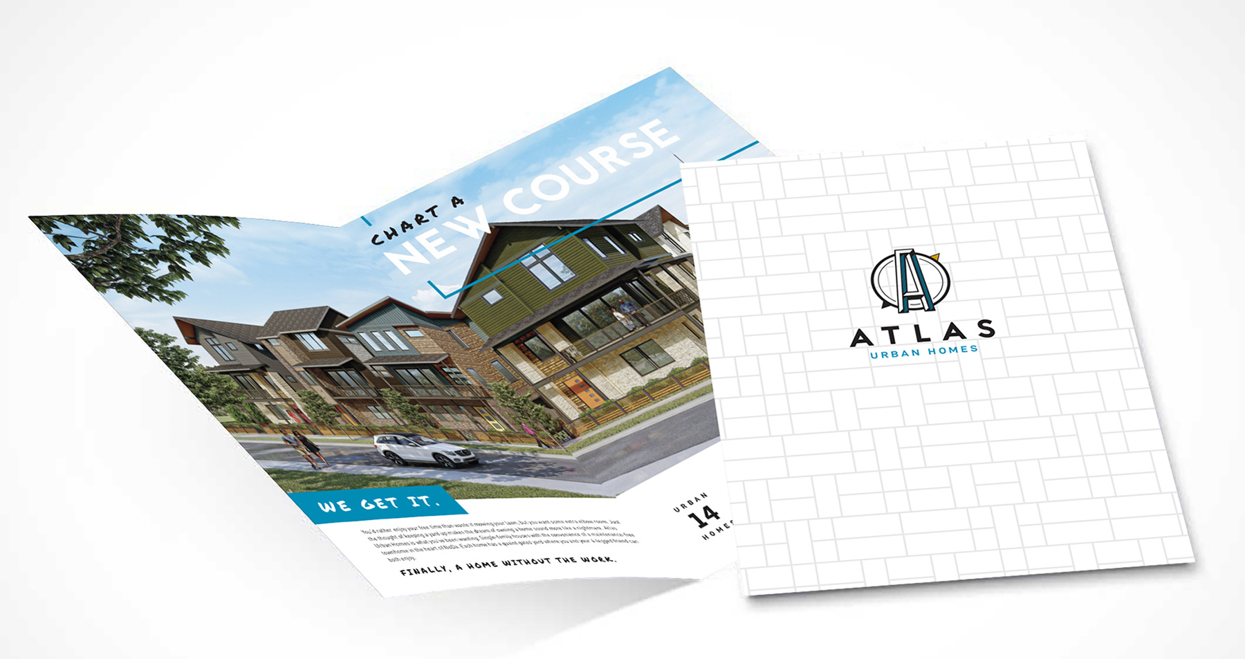
Best Brochure
The cover of the brochure designed for the “Community of the Year” Atlas Urban Homes by niche infill residential developer Revolve Residential is a simple Mondrian pattern inspired by the windows of the preserved church with the logo centered on a soft touch stock that provides a tactile experience. We integrated large bold renderings and headlines in both a sans serif as well as a handwriting font to make it more approachable to a more casual target market who wants to live in an up-and-coming artsy neighborhood.
The creative copy writing embraced the navigation theme which appealed to the target market of buyers who blaze their own trail or make their own path and had a busy lifestyle where they wanted to spend more time on fun activities in the neighborhood than maintaining a home. The content described how this project offered a lock and leave lifestyle while being a detached home which gives more elbow room. The site plan showed the context of the single-family homes with the preserved church turned coworking space and the four townhomes.
Standard finishes and features were of course included along with thumbnails of the three finish package colors so people could get a feel for the tile, cabinetry and carpet. Headlines and floor plan names such as Chart a New Course, Get the Lay of the Land and Make Your Space Legendary speak to the atlas/map inspiration. Of course, the folder also featured the contact information of the sales team and legal disclaimer.
The brochure’s folder pocket held a warranty information flyer, upgrades insert, HOA responsibilities as well as the four different model inserts. A simple floorplan wouldn’t do, so each colorful insert included rendered exteriors and statistics of each model, perspectives of each floor and elevations of side and rear of the homes to show there’s no “ugly” side. They also included all three floors, a description of each floorplan and what makes it distinctive and features. On the rear of the insert, we color-coded the site plan to show where that plan was available and showed the elevation with corresponding paint color for each lot.
Best Logo
Builder of the Year, Hopper Communities, and their sales team from My Townhome had a clear vision of what they wanted in a logo: a friendly but modern logo that conveys the #1 asset of the Uptown West Terraces townhome community: the stunning view of Uptown Charlotte. So our team worked closely with the team to design the logo they desired and the judges agreed – it’s the best!
We appreciate being the go-to marketing agency for these two homebuilders and developers and are grateful they value our work too! We love creating innovative solutions for marketing new homes.